Simple Mantel Styling Tips
Have you ever seen a pretty photo and thought “Oh I love this, but I have no idea how do get this look?” I often have people say to me “I love the way you styled that (fill in the blank). I would have never thought of that!” Good news, friend, I am here to share my decorating brain with you!
NOTE: I don’t have an interior design degree. I’m just a girl who loves to decorate and has noticed over the years that I tend to keep the same concepts in mind. I don’t think that decorating should be difficult, so I am sharing my tips with you!
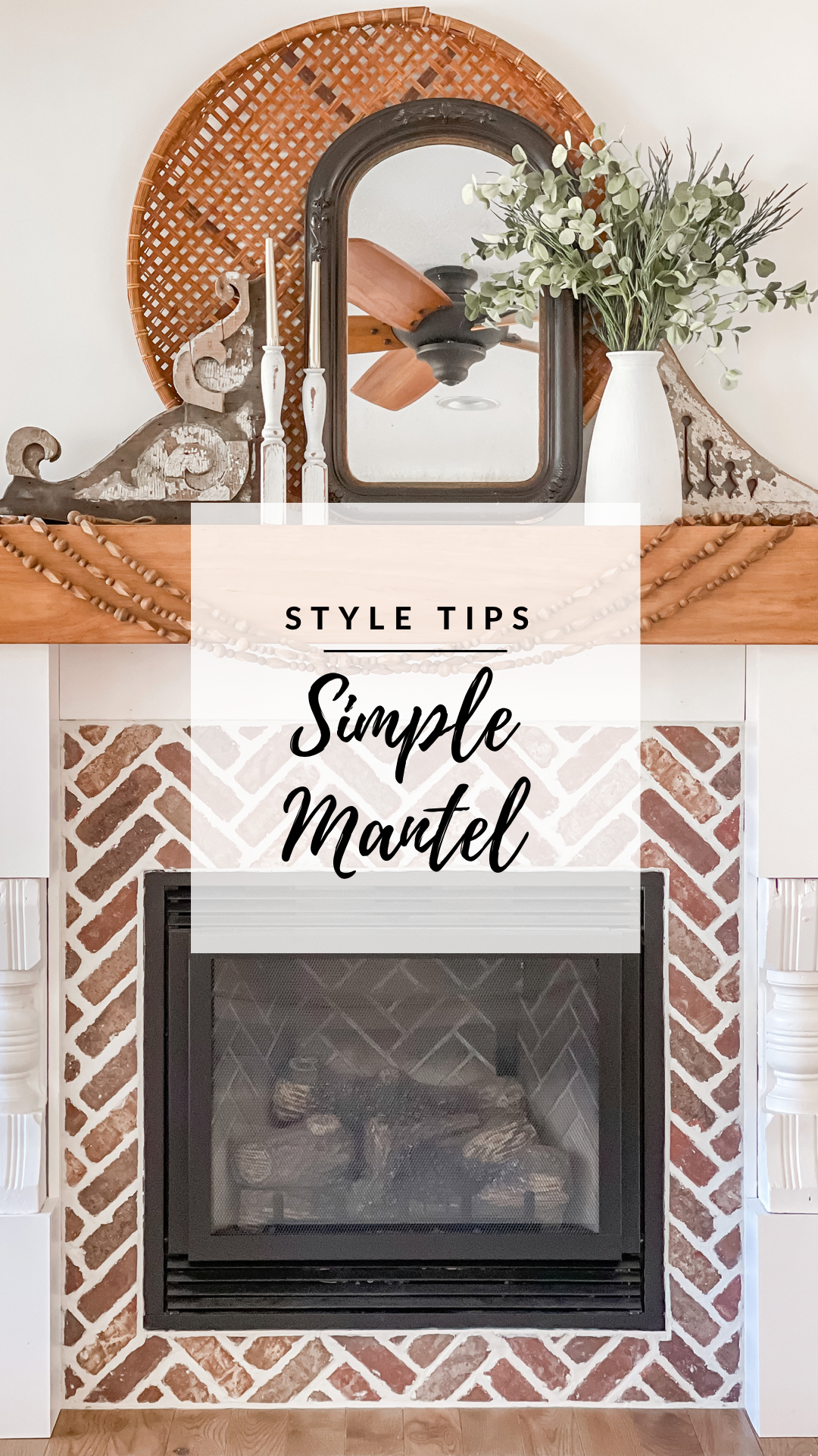
The first thing I look at when decorating anywhere is the vertical space. How much space do I need to fill up? We don't have a tv or a feature wall here, so I knew I needed to start something larger to anchor the focus. So, the round basket was my starting point. From there, I try to have 3 general thoughts in mind: shape, color, and scale. I always want to keep it simple while also achieving balance in those three things.
Keep reading for specific details on shape, color and scale…
For my visual learning friends, here’s a look + listen to my thought process while decorating my mantel!
Shape: I’m not looking for exact symmetry here, just overall balance. I don’t want one side to have a lot of height and the other not have any. For this mantel style, I went with a swooping (low-high-low) shape with the mirror + architectural pieces on either side. One architectural piece is actually taller than the other, but it doesn’t matter because over all it has the same sloping shape on either side.
Color: I tried to balance out the colors with the white vase and the white candlesticks. Because the wall behind them is white and there’s a layer of darker color between, it really makes them pop! The mirror serves as contrast to the white, but also gives a reflective surface (which tends to also make a room/space feel bigger). Of course, greenery always makes a styled spot feel livelier, plus it adds texture!
Scale: The large round basket in the back helps take up space without having to completely fill in the white wall. The next layer of decor is the architectural pieces + mirror. They bring the eye down and out, filling the space horizontally. The vase and candle sticks add varying height. Imagine if they weren’t there. The basket and mirror would look tall compared to the architectural pieces and there would be a noticeable height gap in between. Finally, the garland mimics the round basket and ties the decorated mantel to the brick. (IF you want to see how I hung the mantel, see my TikTok video HERE)
OK, I know that’s really getting into the details. I think it’s easiest to start with three simple staple pieces like the vase with greenery, a mirror, and candlesticks and build around that. Those three items by themselves will help with shape, color, and scale. Once you get concept that down, decorating gets a lot easier, in my opinion. Before you know it, you’re not even taking the time to think about shape, color, and scale, you’ll just know what is missing!
I hope you find this insightful. Feel free to ask questions, I am happy to help!
Happy Styling,

